The Importance of Colours in Print Marketing

Print marketing is a powerful way to reach your target audience. The best thing about print marketing is that it’s not limited by technology or device – you can get a physical brochure into someone’s hands (or mailbox!). And while print media may seem old school compared to digital marketing, it can still be an effective way to communicate with customers and prospects.
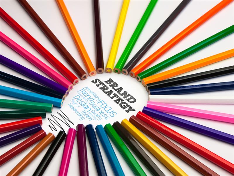
Colours Evoke Emotions
Colour can evoke a wide range of emotions and can be used to communicate your brand image. For example, red is known for its power and strength and can be seen in many sports cars or on fire engines, but it also has a more calming effect when used with pastel colours. Blue is traditionally associated with calmness, which makes it perfect for relaxation brands or luxury products.
Colours are also useful for creating a mood for your product or service – you’re probably familiar with the feeling you get when sitting in front of your computer looking at an ocean scene photo!
Finally, colours can help you create an overall theme for your print marketing campaign by coordinating different elements together – this might include using similar colours throughout all aspects of the design (such as logo on business cards/letterheads) or using complementary shades that complement each other well visually without clashing too much (for example blue & orange).
Colours Convey Personality
As well as helping to attract attention and make a design look more engaging, colours can also be used to convey personality. This is particularly important if you’re trying to market towards a specific demographic.
Colours can help you stand out from the crowd, and they have been shown to make people feel more positive about themselves when they see them. So choosing the right colours for your print marketing campaigns could be key in showing off your company’s personality and culture, as well as reinforcing its values.
If you need help using colours to attract a particular target audience, you can always consult with businesses that offer printing and design services, such as Printroom Banners. Businesses like these often have experience in industries across the board, and can guide you in the right direction.
Colours Attract Attention
Colour is a powerful tool in visual marketing. The right colour can bring attention to a specific part of your page, making it instantly more noticeable to the reader. It’s estimated that 90% of information transmitted to the brain is visual, so using colours wisely can help you get your message across more effectively.
Colours also affect our moods: red is associated with anger or excitement; yellow with happiness; blue with trust and calmness; green with nature and freshness, etc.
Colours Can Create Trust
Colours are also used to give off a feeling of trust and authority, as well as warmth and approachability.
Studies have found that people perceive some colours as more trustworthy than others. For example, the colour blue is often associated with trustworthiness and reliability. Because of this, it’s the most common colour used in logos for financial services (like banks), accounting firms and insurance companies. This perception can be used to your advantage when designing your print marketing materials!
Colour can also create an impression of expertise or competence. People associate red with passion, excitement and risk-taking—think about sports cars or fast food restaurants—and they view black as sophisticated and professional—think business suits or luxury cars.
If you want your customers’ eyes drawn to certain information on page one of your brochure design but not necessarily all the way through page two then consider using these powerful colours strategically throughout both pieces so readers know what parts of each sheet matter most at first glance without needing further explanation from you about why exactly those things need attention now instead later down the road.
Use Colour in Your Print Marketing to Help Set the Mood
While there are many aspects of print marketing that can be considered when developing a campaign, the use of colour is one that often gets overlooked.
While you may have a clear idea about the specific message you want to portray through your design, it’s important not to overlook how colours can be used to set the mood and create an emotional response from your audience.
Colours can help you convey personality within your brand identity as well as attract attention throughout your design. They also play an important role in creating trust with potential customers and clients looking at product packaging or other materials relating to your business.
Conclusion
In conclusion, colours can be a powerful tool in your marketing arsenal. They can help convey emotion, create trust and attract attention. When used correctly, they can even improve conversion rates by making a page more readable!


